
Journals7
Newest
All About Canadian Pride
1 min read
Did my DeviantArt feed go dead over the past year and a half? It's no mistake. I've been held up over the past year and half with the CMA program. With that now over with, I can get back to my graphic design hobby. Anyway, here are a couple of quick updates.
1. I have started doing icon designs for commercial use on the side. If interested, feel free to contact me.
2. I submitted two new deviations recently showing some Canadian pride. The first is a wallpaper and the other is a maple leaf icon, featured here:
Canada Aqua 16×9
Aqua Redux (Maple Leaf)
3. These two deviations are part of a new work in progress called "Aqua Redux". I used some design elements from Mac OS X's Aqua theme, but with a new twist. Hopefully, I can get some more icons published soon. (Smile)")
Cheers!
- mulletrobz
1. I have started doing icon designs for commercial use on the side. If interested, feel free to contact me.
2. I submitted two new deviations recently showing some Canadian pride. The first is a wallpaper and the other is a maple leaf icon, featured here:
Canada Aqua 16×9
Aqua Redux (Maple Leaf)
3. These two deviations are part of a new work in progress called "Aqua Redux". I used some design elements from Mac OS X's Aqua theme, but with a new twist. Hopefully, I can get some more icons published soon.
Cheers!
- mulletrobz
Join the community to add your comment. Already a deviant? Log In
A Crazy Start To 2010
1 min read
Greetings!
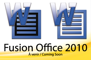
So 2010 has been in full swing for a while and it definitely has been crazy. Started my two-year CMA program in January and it has literally taken over my life to a point where I simply haven't had the time to work on some art or take some nature photos! However, I did finish the Fusion Office 2010 icon set in December, which can be downloaded by clicking the link below if you haven't already done so:
mulletrobz.deviantart.com/art/…
If I do get some time, I would like to finish creating a white version of those Fusion Adobe CS4 icons and I'll be keeping an eye as to what Adobe will have in store for CS5. And if you are looking for other high quality icons, I suggest checking out the iconbox group (iconbox.deviantart.com)!
Cheers!
- mulletrobz
Join the community to add your comment. Already a deviant? Log In
A New Icon Project
4 min read

Join the community to add your comment. Already a deviant? Log In
MIA for Months
1 min read
Has it been more than a year since I wrote a DA journal entry? Wow, how the time flies!
Over the past year, I started an accounting job, enjoyed life whenever possible, and started night school (taking Operations Management) two weeks ago. Because of all that craziness, among other things, I have not been able to produce much in terms of new artwork. But for those who did not check my gallery lately, I did submit another Adobe icon set in March in order to reflect Adobe Creative Suite 4's design theme, the link for which is below. Almost 600 downloads and 1800 views over the past four months.
mulletrobz.deviantart.com/art/…
I'll probably add the remaining icons for that Fusion Adobe CS4 icon set after I'm done with night school in August, but after that, who knows when I'll be able to find the time to create a new deviation. For the time being, keep it real! (Wink)")
-mulletrobz
Over the past year, I started an accounting job, enjoyed life whenever possible, and started night school (taking Operations Management) two weeks ago. Because of all that craziness, among other things, I have not been able to produce much in terms of new artwork. But for those who did not check my gallery lately, I did submit another Adobe icon set in March in order to reflect Adobe Creative Suite 4's design theme, the link for which is below. Almost 600 downloads and 1800 views over the past four months.
mulletrobz.deviantart.com/art/…
I'll probably add the remaining icons for that Fusion Adobe CS4 icon set after I'm done with night school in August, but after that, who knows when I'll be able to find the time to create a new deviation. For the time being, keep it real!
-mulletrobz
Join the community to add your comment. Already a deviant? Log In
Graduated ... Now What?
1 min read
Well, at long last, I've graduated from university and now, I'm simply trying to figure out what to do next. So for the time being, I thought I'd get back to doing some icon designs and just now, I figured out how to do my next icon set. It's called Graphite2 and I uploaded an image with a few recently completed icons, although the PDF one will definitely be replaced. Anyway, here's the link and some initial feedback is welcome. And don't worry. It will also be available for Mac and PC when it's ready.
mulletrobz.deviantart.com/art/…
Cheers!
mulletrobz.deviantart.com/art/…
Cheers!
Join the community to add your comment. Already a deviant? Log In